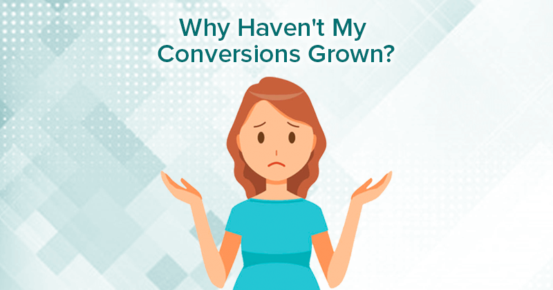
You’ve come to us and you’ve done everything we recommended. Your SEO and SEM programs are now driving significant traffic to your site. More traffic than you’ve ever seen before. And yet, this hasn’t translated into increased conversions and sales. Not to worry. We’ve seen this before. And the reason is… User Experience. The truth is if you don’t see an uptick in your conversions, it’s likely your website needs to be optimized to improve user experience.
Here are some stats for you to chew on (compiled by SmallBizGenius)
- About 75% of people’s judgement of your company is based on how your website looks (British Computer Society).
- 88% of online shoppers won’t return if they have a bad experience with your website (SmallBizGenius).
- 44% will tell a friend if they’ve had a bad experience with your website (Neil Patel).
- Better UI can impact conversion rates by up to 200% and better UX design could increase rates up to 400% (Forrester).
- The cause of 70% of business failures is bad usability (Uxeria).
- Over half of visitors to a mobile-site will leave if it hasn’t loaded after 3 seconds (Think with Google).
- A one-second delay in page load time equals a 7% reduction in conversions (Neil Patel).
- 94% of people find old websites untrustworthy (MyTechlogy).
Without a great user experience on your website, your SEO and SEM programs impact could be minimized. Great SEO and SEM really does go hand-in-hand with great user experience.
What is a Great User Experience?
Generally, a user has a great experience when these conditions are met:
- Easy-to-use
- Pleasant-to-use
- Meets their expectations
- Achieves what they want
10 Tips on How to Improve Your Website’s User Experience
If after implementing an SEO or SEM program you have not seen your conversions increase, we’ve got 10 tips below on how to improve your website user experience. Not every website is the same, and some aspects may just need to be tweaked, so these tips are not placed in any order of importance.
#1 Undertake In-Depth Monitoring
If you can’t measure it, you can’t improve it.
So said Peter Drucker, a business management guru. And this is very true when it comes to website design. Many companies know they need to redesign their website, but countless companies just change the design without first measuring what worked or didn’t work. There are various tools out there (such as Crazy Egg and Hot Jar which let you measure what people actually do on your site. Spend the time monitoring and collecting data on what people are actually doing, and then optimize with A/B testing.
#2 Optimize with A/B Testing
Once you’ve monitored for enough time that you can gain some insights, start to change elements and conduct some A/B testing. In this video, marketing guru Neil Patel recommends that you optimize page by page, element by element and conduct A/B testing. We don’t go so far as recommending you never re-design your website even if your old one works (because if a user perceives your website as being old and out-of-date that can bring about credibility issues), but we definitely think you should conduct A/B testing on the old site to know what works and take that information with you into the new redesign (and then continue to conduct A/B testing).
#3 Reduce Content and Calls-to-Action
The best companies know their target audience so well, they simply use their website to easily guide their users right into converting. Most websites have to please the user no matter what stage they are in of the marketing funnel—whether they’re just browsing or on the hunt for some in-depth information. The response of most companies then is to give so many choices that the user doesn’t know where to go or what to do next. We suggest reducing calls-to-action, and reducing content (including copy) to the most important information, collateral or elements needed. Know your audience so well—and following Tips #1 and #2 will help you achieve that—that you know what they want and when they need it, so yes, you can guide them right into the right choice—buying what you have to offer.
#4 Improve Navigation
Most people actually do like to use maps when necessary. And the same goes for a website. People come to your site to find information or to do something, so make it easy for them to do so. To understand better where people might be getting lost or exiting out of confusion, use monitoring tools to make sure your putting information where people can find it so they don’t leave in frustration. As well, make sure it’s very clear to people where they are in the website.
#5 Reduce Data Entry and Number of Steps to Achieve a Goal
The more you ask people to do, the more-likely they will abandon that action before they achieve their goal (and yours too). Take a hard look at all the information you are trying to collect on a form and ask yourself if you really need the information, or if there’s another time – later in the sales cycle – where you can get that information when people are more invested. Don’t make people jump through hoops to download that white paper or they never will.
#6 Increase White Space
When it comes to websites, less is definitely more. Use white space as a design tool to focus people’s attention, improve readability, increase their comprehension of the relationship of elements (including dividing elements on a page without using lines), as well as give the website a more professional feel and thereby increase credibility.
#7 Optimize Page Speed
It’s likely your website is too slow and you’re losing business because of it. How can I say this with such confidence? Because most statistics point to the average load time being over 8 seconds. Yet, the average time people are willing to wait for a page to load is 3 seconds. People are so impatient, and you’re losing so much opportunity and money because of this issue, we’ve written a couple of blog posts about it. Check out Why Page Speed is So Important and 5 Ways to Increase Page Speed.
#8 Include Easy-to-Find Contact Information
There’s nothing more frustrating to a user then to have a problem and not being able to find the contact information. Yes, we understand you want less people contacting you for basic information or assistance as it can increase costs. But, you can reduce the likelihood that people will contact you by having a great website with the information they need at their fingertips. Most people don’t actually want to talk to a person unless it’s necessary (for example, Mind Share World found 79% of users would want a human to step in if a chat bot can’t solve their problems, which could also be taken to mean that 79% accept the use of a chat bot rather than a person!). So, most people are only going to reach out if they can’t meet their goals on your website, whether that’s finding information or completing a purchase. A study in 2015 by KoMarketing found that 64% of users want contact information on a website, likely for this very reason. You also don’t want to give the user the impression that as a company you’ve got something to hide and don’t want them contacting you, which will impact your credibility.
#9 Ensure Your Website is Mobile-Friendly
We can’t emphasize enough how important it is that your website has a responsive design and is mobile-friendly. It’s highly likely that if you didn’t build your website from scratch, you’ve built it on a content management solution (CMS) in which case all designs are likely already responsive and mobile-friendly. But we think there’s more to being mobile-friendly than just a responsive design and that you should design your website for mobile in mind first, then consider desktop. We’ve written a couple of blog posts related to mobile, 5 Ways to Mobile-ize Your SEO Strategy and 5 Ways to Improve Your Mobile Conversion Rate, which elaborates on this tip.
#10 Rely on Website Conventions
Don’t reinvent the wheel! Conventions are good. Conventions are mental short-cuts and we suggest that you rely on them for your website design. If you put a search box somewhere in the top right side of your website, no one is going to get frustrated because they can’t find the search box. They know that’s the first place to check. Yes, people like new, but they don’t like change. Don’t make them have to think too hard as to where to find something, or they will just leave. The point isn’t to have the most original website design, but to have a website design that helps people to buy your product, or buy your services or to achieve the goals of your website.
As you can see from all these tips, there are some themes running through them. Simplify. Make it easy for people. Understand who your target audience is, what they are doing and what they want. And if you do, we think you’ll improve conversions and get a competitive edge.
Below, I’ve included a screenshot of Google’s home page so you can see how many suggestions we’ve outlined above that Google has already followed in their own design (without our advice, sadly).

Why spend time figuring out all this stuff? We’re the experts on everything to do with search. Contact Us Today